March 30, 2011
It's the Wednesday mini dance par-TAY!
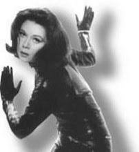
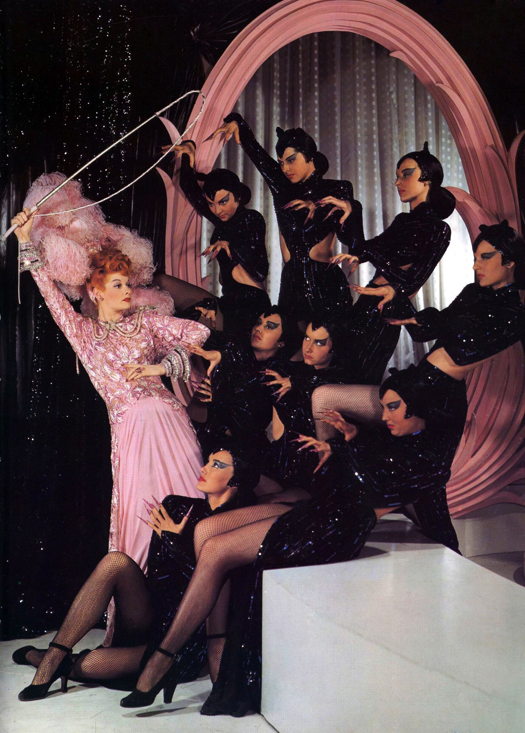
We haven't had a par-TAY! in weeks! Today, it's Lucille Ball and Britney Spears (there's a combo you never thought would happen)---Lucy dances while Brit Brit sings her song "Circus." I've been watching "I love Lucy" dvds lately but, people tend to forget that Lucy was a succesful model, radio actress and movie star long before playing Lucy Ricardo. Here she is in her "Catwoman tamer" dance from the film "The Ziegfeld Follies"--a great movie that has no plot, it's just a collection of song, dance and comedy numbers together in one film, from some of MGM's biggest stars of the era.


March 29, 2011


March 27, 2011


March 26, 2011
Click your Burgundy slippers together and follow the Mustard brick road to the drab Olive city...
Hello...It's time for a rant about color. Or more specifically, why everyone is so afraid of it? That seems to be the case. Hollywood, especially. Movies and shows used to be vibrant and rich with color. Remember? But not now. If today's Hollywood art directors were around back then, this is what the Wizard of Oz would look like...

...which is not good. It's dark, drab and dull. And no fun at all. But that's the norm these days. Think about it. Almost every time some superhero movie comes out it's drab and dark. Every color is muted. The costumes are altered greatly in color or made entirely Black (think all the X-men movies, think Daredevil, Watchmen, etc) everything is dark. I used to think it was because they wanted everyone to look like Batman. Dark and grim. And somehow that's supposed to make people take the characters more seriously and be easier to relate to. But now, I think it's a fear of color. Take the new Wonder Woman costume for instance. One thing I liked about it was the bright colors. That's how heroes in comics are COLORFUL. It was refreshing to see actual color for a change. But there were many other elements of the costume design I didn't like. The biggest problem being the fabric. It shows every wrinkle and flaw and just looks so cheap and trashy. Everyone else it seems, thinks her cheap look is due to the color. And many color muted versions swarmed the net...I give you exhibit A...

...she gets, more boring and dull, the more muted the colors get. And the fabric still looks cheap. Now shes' cheap and dull. At least the colors were exciting. But this is how people do it and think these days. Like they want superhero costumes to be able to blend in with the outfits worn at your office. She's a superhero---not your office accountant! Heroes are supposed to stand out. They can fly! They have super powers! And none of those powers involve looking boring or writing TPS reports. Nobody is rushing to the window yelling "Look up in the sky! It's drab office man!" But so many think that the color was just too much. Okay fine, then let's apply the same muted colors to Lynda Carter's Wonder Woman costume (which everyone liked) and see what we now think...

...of course Lynda is still beautiful but, there's no excitement and now her costume is as drab as Diana Prince's uniform---which was drab and boring to make Diana blend in with the people at the office---(see where I'm going with this?) Yeah, it's just all wrong. And Lynda's costume looks like "Chanel" next to the cheap fabric costume on the new chick. Part of the reason nobody minds Lynda's bright costume was because Lynda acted the crap out of her character. She gave a believable sincerity to her role and made us look past the bright costume to the person inside of it. Which is why the new chick has such enormous shoes to fill in the public's mind. And when an actor can do that, then the colorful costume doesn't matter, and it only adds to the fun. The original Superman and Spider-man movies actually stayed pretty true to the original costume colors, as did the Iron Man movies. And the actors were also captivating in their performances, and the story lines were good as well. But back to color...I also think straight men today don't like color on superheroes, MALE superheroes especially because they think it makes them look "gay." Yep, good old fashioned homophobia towards color. Yellow on Wolverine makes him too gay so, butch it up by dressing Hugh Jackman in all black, etc. Hmmm, yet they never seem to think those gay uniforms the players on their favorite football team wear is gay at all. Oooooh nooooo...turquoise and orange on a man is so hetero. These same men will proudly wear a jacket with their team colors in public daily---purple and gold with some glitter stitching is so butch---if a football team wears it, I guess. But on a superhero the colors have got to be muted and dark. Honestly, another problem is I don't think Hollywood today knows how to film color or make color work for a film or show. In the past color added to the drama and was used to set tone and mood, emotion and climax of a film. As well as just making a film more interesting and exciting and more enjoyable. Lets take a look at some other possible color muted examples and the loss of impact...


...here's a great example of color muting of Superman. In "Superman III", Superman briefly becomes evil and to express this change the costume colors were muted for evil Superman. And then there's the "Superman Returns" costume, several years later...

...and how about Star Trek? Nobody had a problem with the original show colors, again the color added to the show's excitement but, fast forward to the remake...

...I know. I know your saying "but times have changed and we can't do movies with bright colors like that anymore. It's too bright, it's too fantastic, nobody can accept colors like that and still follow the story. Or believe the story because they're too distracted by all the colors." Hmm, maybe but then again...Did you see Avatar? Wasn't it full of bright fantastic scenery and colors? Wasn't the star vividly blue in a neon world of color? Wasn't it a gigantic worldwide hit? How would it have been if it was muted and dark?...

...didn't the bright colors help the story? I think it did. I think it added to the story and made sitting in the theater for about 3 hours go by quickly...

...So, in conclusion, bright colors good, muted colors bad. And if you have good actors and a good story you can dress them either way. But I think that color can help add more interest...

...and I think people need to stop being afraid of color. Color is part of what makes the world beautiful. And I think color is going to be making a comeback. So, get used to seeing more of it again. Because it's not that scary :)


Subscribe to:
Posts (Atom)